Tuesday, 10 March 2015

Hakuna Holiday Evaluation


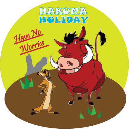
1st Logo

Good
-References to the characters who said 'Hakuna Matata'
-Clear images
-Clear title
-Clear slogan
-Slogan references to the lyrics of the song 'Hakuna Matata'

Bad
-Timon and Pumbaa are different settings of live trace and it is easily seen
-The sides are unbalanced


2nd Logo

Good
-Clear Title
-Clear Slogan
-Clear Characters/Images
-Clear background setting
-Background refers to the movie the characters
came from. e.g big sun and Pride Rock
-References to the famous saying by the
characters in the title
-Slogan refers to the song 'Hakuna Matata'

Bad
-Pumbaa only has one clear eye
-Pumbaa has thin white outline around his legs
-Timon has a thin white outline in some places


After ebi comments.


After ebi comments:

To create an effective logo I used four different techniques; Rotation, Live Trace, Re-size and Flip. I also used the hand drawing tool, writing, shapes and different colours.

The examples of the four techniques are shown above. I got the two original images from Google and I edited them in Illustrator by adding the 'Live Trace' effect. This effect makes the image look like it has been traced over. This is effective because it shows that the logo has been thought about and not just gathering images from Google then adding words and a background. I used the technique 'Rotation' on the slogan. This gave the logo a small variety of dimensions instead of a very straight, still logo. I used the technique 'Flip' on Pumbaa. I did this because I liked the image enough to use it but I didn't like the direction he was facing so I flipped the image to suit what I thought was right. Finally, I used the technique 'Re-Size' on the other image, Timon. I did this because I liked the image but once I pasted the image into Illustrator it was bigger than the other image. If I left the image as it was it wouldn't be like the movie and characters I was trying to make a reference too therefore it would look silly and the image would look out of place.

I used the 'Hand Drawing Tool' on the grey rock in the background. The rock is meant to be a reference to Pride Rock. To make the hand drawn shape the colour grey I drawn the outline of the shape I wanted, not joining the ends together. I selected the shape then went to the colour wheel and selected the colour 'Grey'. This coloured the shape but at the end of the shape there was a straight grey line connecting the ends of the black outlines. To be able to keep the shape and hide the unconnected ends, I placed the dirt floor (Brown circle) over the bottom of the shape. This gave the effect of the rock being in the distance and that the two images were standing on a hill.

I have used different colours to make the logo more appealing. The colours I have used are: Brown, Yellow, Light/Dark Green, Grey, White, Blue and Red. I have used natural colours (e.g. Yellow and Brown) for the sun and dirt and grass. I used more bright colours (e.g. White and Blue) for the title and slogan. The bright, oddly placed colours, grab the audiences attention to look at the logo and discover why they are there. This makes the audience read the information and understand why those colours are there.

I have used different shapes in the background and the underlining of the slogan. For the background I used two circles, one yellow and one brown. I made the first circle (Yellow) and then re-shaped the second circle (Brown) to make it look like the floor of the logo. The angle that the brown circle is created at gives the effect of a dirt floor and that the two images are standing upwards. I also used the rectangle shape to make the slogan look underlined. I did this because I couldn't work out how to underline the slogan and I felt that it needed to look different from the title.






Tuesday, 10 February 2015

Vector Adverts Good & Bad


Toyota Advert

This adverts theme is to excite the audience about a new Toyota car. The vehicle is a silver version of the car, placed into the center of the advert. Around the car is a city landscape background where the colours have been changed into singular block colours. 
This is a good advert because the cars colour against the background is easily seen which means that the audience can see every door, window and wheel on the car. The outrageous colours in the background excite the younger viewer because it isn't a dull, boring, everyday street like they see in there daily lives. 

Coca Cola Advert

This adverts theme is to encourage Coca Cola drinkers to become more adventurous and to do what they what to do with their lives. This message is portrayed by having the famous red and white colour combo to make the audience recognize the company and by having the famous glass bottle shape be dotted in the center. The message of the advert "You don't have to stay inside the lines" is written inside the bottle whilst the colour white is presented in a way that makes the audience think of someone colouring outside the lines. 
This is a good advert because the image connects with both adult and children drinkers by casting their minds back to when they didn't care what people thought of them as they coloured carelessly outside the lines and that thought is transferred to their daily lives, encouraging them to carelessly colour outside their lines.

Frooti Advert

This is a bad advert because the theme of the advert isn't clear to the viewer. The advert is promoting a carton drink and the drinks slogan. The carton design is not effective because most of the space used is of a picture of a fruit that isn't clear of what fruit they're advertising. Part of the slogan is put at the bottom and the title is put at the top leaving minimum space for anything else until the design would become crowded and busy. The background of the advert is the colour yellow with outlines of the unclear shape, small groups of love hearts that seem out of place and the long slogan written in a simple font, coloured purple, across the bottom of the advert. The carton drink is in the center, slightly angled to the left and the drinks title at the top.

Wall Advert

This is a bad advert because the company name isn't clear to see at a glance and the slogan isn't easy to read. 


Tuesday, 6 January 2015

Vector

Hardware  3
Hardware is a piece of physical equipment that helps the user use the computer. For example: a Keyboard, a Monitor and a Mouse.

Software  3
Software is a program that is inside the computer and can not be physically touched. For example: Word, Photoshop, Power point, Publisher and Fireworks.

Vector  4
Vector images are images that can be enlarged and enlarged without being able to see distortion throughout the image. Vector images are used on billboards, vans and any other place where advertising through images can be placed/done.

Input  4
Input is where the user inserts information through a type of media. For example: words from a keyboard to images on a memory stick.

Output  4
Output is where the users information is displayed. For example: the words/letters being typed being shown on the screen.

Vector/Bitmap Input Devices  4
Vector/Bitmap Input Devices are devices, such as a keyboard, that allows vector/bitmap images to be displayed onto the screen of a computer.

Vector/Bitmap Output Devices  4
Vector/Bitmap Output Devices are devices, like a computer screen, that displays vector images through a vector input device.  

Vector Image Construction  6
Vector images are constructed through the use of mathematical points, lines and curves. Vector images are based on vectors (also called paths) that flow through the control points or nodes. Each point is positioned on either x and y axis and controls the direction of the vector/path. Further on each path is either assigned a colour, shape or thickness that creates the image.

Vector Software  5
Vector images are created through applications called Adobe Illustrator, CorelDRAW and Adobe Freehand. Applications used to create and edit vector images are called Drawing Packages. Vector software programs are complicated to learn to use and that is a limitation for many people using vector software programs.
Adobe Illustrator-
The most popular vector image creating application. Illustrator was originally used                             to create vector prints but can now also be used to create web and screen based                                   graphics. Illustrator is complicated to use because of it's many different effects/objects that can be used.
CorelDRAW-
Another popular vector drawing application. CorelDRAW is similar to Illustrator but                           CorelDRAW allows for multiple page editing where as Illustrator only allows for one                         page editing. Corel is like Illustrator, it has many different effects/objects that can be used.
Adobe Freehand-
Formerly know as Macromedia, Freehand is used for creating vector graphics for                               web platforms and desktop publishing.

Digital Camera  ---
A Digital Camera works by using light rays that travel through pieces of glass (e.g lens) and bouncing of mirrors depending which mode you are in. The light rays bounce off the mirror when the user is using the viewfinder and not taking the picture. Once the light rays have been reflected by the mirror they then bounce of the sides of the cameras body and is then aimed through the viewfinder which is where the image about to captured can be seen. If the user is taking the picture the mirror is used to shut off the viewfinder prism and the light rays, instead of bouncing off the mirror, go forward towards the shutter so that the image can be clearly taken.

Scanner  ---

A Scanner is a device that captures images through photographic prints and other sources for computer editing and display. Scanners come in a variety of sizes from hand-held to flatbed types. Some scanners only scan black and white images but some scan colour images as well. Depending on the quality of resolution, the scanner is used for different jobs and purposes. High-resolution scanners are used to print high quality images but low resolution scanners are used to print computer images for computer display only.

Bitmap  6

A Bitmap image is made up of tiny parts called pixels. Pixels are blocks of colour that creates the image. When a bitmap image has been enlarged you will start to see blocks connecting to one another. Each block contains different shades of colours whether 20 blocks are containing light blue and 3 blocks are containing dark red OR every individual block is containing a different shade of one colour or a different shade of eight colours, those blocks make up the image.  Bitmap images are used for photography that includes a range of colours and different effects such as shadows.

Bitmap Software Packages  5
-Adobe Photoshop
Photoshop is used to create both print and screen designs.
-Adobe Fireworks
Fireworks is a combination of image editor, bitmap creator and vector drawing.
-Microsoft Publisher
Publisher is a program that allows people to focus on page layout and composition
-Paint
Paint is a computer graphics program
-Corel Painter
Corel is used to create bitmaps and creates natural-looking images.
-Corel Paint Shop Pro(PSP)
Painter Shop Pro is an image editor and is a graphics creation package.  

Comparing Vector Software  7
The two most popular vector software programs are called: Adobe Illustrator and CorelDRAW. These programs are similar but have some differences.

Adobe Illustrator
CorelDRAW Logo
   Advantages
Adobe Illustrator Logo

-Can create web and screen based graphics
-Most popular program
-Creates vector prints

   Disadvantages
-Single page editing

CorelDRAW
 Advantages
-Multiple page editing
-Second popular program
-Same to Illustrator

 Disadvantages
-No single page editing
-Same to Illustrator


Tuesday, 18 November 2014

Online Communicaton

Methods of Communication
-Text Messages
-Phone Call
-Video Chat(Skype, Facetime etc.)
-Twitter
-Instagram
-E-Mail
-Snap Chat
-Whatsapp

-Blogs
-Facebook

What Is Web 1.0? 
Web 1.0 is the name given for the first stages of the World Wide Web. This stage of the World Wide Web only consisted of webpages connected by hyperlinks. Web 1.0 is generally believed to be referring to websites that were not yet providing interactive information.

What Is Web 2.0?
Web 2.0 is the name given to the second generation of the World Wide Web. This improved version of the web focused on letting users of the internet share information online. Web 2.0 generally refers to the web coming from static webpages to more interactive webpages.

What Is A Forum?
An Internet Forum is a site that allows others to communicate through the internet. It is also called a message board. A Forum is different to a Chat Room because users can visit the Forum at any time unlike a Chat Room which is live.

What Is A Blog?
A Blog is a regularly updated website usually ran by an individual or small group written in a conversational style. The word Blog is a shortened word from the word 'Weblog'. A Blog can be used to express an individual through images, videos and words. A Blog can be about anything the user/users want it to be about like: Food, Animals, Sport, Puppets, Technology, School etc. The posts that are written in a Blog can vary from length. They can be short or long posts.  


What Is A Microblog?
A Microblog is a site that is frequently updated but the posts are short and simple. Like a Blog a Microblog can be about anything the user/users are passionate about. This could be Sport, Food, Modern Technology, Interior Design, Fishing etc. The difference between a Blog and Microblog is that a Blogs posts can vary in length whilst a Microblogs posts are short and simple. 

What Is A Chat Room?
A Chat Room is a site that allows users of the internet to communicate. It is usually about a single topic. In a Chat Room users can share thoughts and ideas about the topic discussed at any time during the time the Chat Room is being used. A Chat Room is different to an Internet Forum because the Chat Room is live unlike an Internet Forum which is able to be viewed by users at anytime.  
What Is a V.O.I.P?
V.O.I.P stands for Voice Over Internet Protocol. If the user has a reasonable quality internet connection they can use the internet connection instead of their local phone service. The way a V.I.O.P works is that you need to turn the analog phone signal into a digital phone signal for it to connect to the internet. The reason some people use a V.O.I.P is because of 1)Lower costs and 2)Increased function. 


Tuesday, 4 November 2014

Online Services and Communication

What is a Browser?
A browser is a tool that allows you to access the internet. For example Google Chrome, Firefox, Internet Explorer etc. Different browsers bring up different websites and web pages.

What is a Webpage?
A webpage is a single document located inside a website. It can have videos, pictures, graphs etc on it. A webpage is different to a website.

What is the Internet?
The internet is where all computers are connected to be able to access information. It is world wide.

What is a Deep Web?
A deep web is information that is only accessibly with a password.

What is a Visible Web?
A visible web is what is shown/listed on the website that is accessible to get information from.

What is a URL?
The URL is also known as the address bar that you type in to reach certain websites or webpages. For example 'www.Google.com'.

What is an ISP?
ISP stands for 'Internet Service Provider'. Adults pay a company like Sky or TalkTalk to use the internet.

What is a Search Engine?
A search engine is a program that allows up to search for information via the internet.